You don’t need Elementor, Divi, or any other page builder to create a WordPress landing page that actually converts visitors into customers. That might sound controversial in 2026, but the native WordPress block editor has quietly evolved into a legitimate design tool, and most people haven’t noticed yet.
Here’s the thing about WordPress landing page design in the page builder era: you’re trading performance for convenience. Most page builders load hundreds of kilobytes of JavaScript and CSS on every single page, even when you’re only using a handful of widgets. That overhead translates directly into slower load times, and according to data from Unbounce’s analysis of over 41,000 landing pages, every second of delay costs you roughly 7% in conversions. When the median landing page conversion rate sits at 6.6% across all industries, you can’t afford to give away performance points to bloated code.
WordPress powers 42.6% of all websites as of March 2026, and the block editor that ships with it has grown far beyond the basic paragraph-and-image tool it was at launch. With WordPress 7.0 arriving on April 9, 2026, bringing responsive block controls, content-only pattern editing, and Cover block video backgrounds, native Gutenberg is closing the gap with page builders fast. The question isn’t whether you can build a high-converting landing page without a page builder anymore. It’s whether you can afford not to.
This guide covers every step of designing a landing page that converts using only the WordPress block editor and a lightweight block theme, from choosing the right foundation to placing your calls to action where visitors actually click them. No page builder required. You’ll get a complete blueprint for building landing pages that load faster, rank higher, and convert better than anything Elementor or Divi can produce.
Why Page Builders Are Killing Your Landing Page Conversions
 1")
Page builders like Elementor, Divi, and WPBakery were revolutionary when they launched. WordPress’s editor couldn’t do much beyond basic text formatting back then, so these tools filled a real gap. But we’re not in 2018 anymore, and the performance cost of page builders has become increasingly difficult to justify on pages where every millisecond directly affects your bottom line.
A typical Elementor page loads dozens of scripts and stylesheets regardless of which widgets you actually use. Independent testing shows page builders can add 200-500KB of JavaScript per page load, and images on builder-made pages often account for up to 70% of total page weight.
A typical Elementor page loads dozens of scripts and stylesheets regardless of which widgets you actually use. Independent testing shows page builders can add 200-500KB of JavaScript per page load, and images on builder-made pages often account for up to 70% of total page weight.
There’s also the lock-in problem. Build a landing page in Elementor, and your content is stored in proprietary shortcodes. Switch themes or deactivate the plugin, and you’re left with a mess of broken markup that takes hours to clean up. The native block editor stores content as standard HTML with lightweight comment delimiters, which means your landing page content stays intact no matter what theme you’re running. If you’ve ever compared the two approaches side by side, the difference is striking, and our Gutenberg vs Page Builders comparison breaks down exactly where each approach wins and loses.
The performance advantage is real and measurable. A Gutenberg-built landing page typically saves 80KB or more in CSS files alone compared to a page builder equivalent. Fewer HTTP requests, smaller page sizes, faster time-to-interactive. All of that translates into better Core Web Vitals scores, which Google uses as a ranking signal. If your landing pages depend on paid traffic or organic search, that performance edge directly impacts your return on ad spend.
Setting Up Your Foundation: Theme and Page Template
 2")
Your theme choice determines roughly 60-70% of your landing page’s performance ceiling. That’s not a number to ignore. For a landing page that converts, you want a block theme (also called an FSE theme) built on WordPress’s native Full Site Editing architecture, not a classic theme with Gutenberg compatibility bolted on as an afterthought.
Block themes use JSON-based configuration through theme.json instead of heavy PHP template processing, which eliminates a significant chunk of server-side overhead. A theme like DigiFlash loads in 0.3 seconds with zero jQuery dependencies and only includes the CSS and JavaScript your pages actually need. Compare that to traditional themes that load megabytes of unused assets on every page request, and you’ll see why the theme choice matters so much for landing page performance. If you’re still weighing your options, our guide to the best WordPress block themes covers the top FSE options available right now.
Once you’ve activated a block theme, create a new page in WordPress and give it a distraction-free template. In the Site Editor (Appearance > Editor), you can create a custom page template specifically for landing pages. The key is removing the navigation menu, sidebar, and footer, because every external link on a landing page is an exit point. Research consistently shows that removing navigation from landing pages increases conversions because visitors have fewer distractions pulling them away from your call to action.
To create a landing page template in the Site Editor, navigate to Appearance > Editor > Templates, then click the plus icon to add a new template. Select “Custom template” and name it something like “Landing Page.” Remove all template parts except a minimal footer with your privacy policy link (you’ll need that for paid advertising compliance). Set the content width to full-width so your sections can span the entire viewport. This blank canvas is where you’ll build every element of your landing page from scratch, using only native blocks.
Don’t skip the global styles setup. Go to the Styles panel in the Site Editor and define your base typography, color palette, and spacing values before you build a single section. This creates a design system, so every block you add automatically inherits consistent fonts, colors, and spacing. Without it, you’ll waste hours manually styling individual blocks and end up with the inconsistent, “designed by committee” look that plagues most DIY landing pages.
Building Your Above-the-Fold Hero Section
 3")
Your hero section makes or breaks the entire page. Visitors decide within seconds whether to stay or leave, and everything above the fold needs to answer three questions immediately: what do you offer, who is it for, and what should I do next? Get this wrong and nothing else matters because nobody scrolls past a confusing hero.
The Cover block is your best friend here. It lets you set a background image or video with a text overlay, and you can nest headings, paragraphs, and buttons directly inside it. Start by adding a Cover block, uploading a high-quality background image (compressed using WebP format for optimal loading speed), and adjusting the overlay opacity so your text remains readable. If you want to go deeper on image formats and compression, our WordPress image optimization guide covers WebP vs AVIF performance in detail.
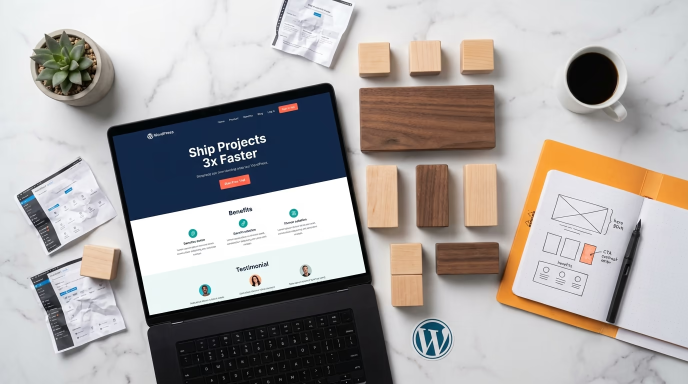
Inside the Cover block, add a Heading block for your main headline. Make it benefit-driven, not feature-driven. Instead of “Our Project Management Software,” write something like “Ship Projects 3x Faster Without the Chaos.” Keep it under 10 words.
Inside the Cover block, add a Heading block for your main headline. This needs to be benefit-driven, not feature-driven. Instead of “Our Project Management Software,” write something like “Ship Projects 3x Faster Without the Chaos.” Keep it under 10 words if possible, and use an H1 only if your page template doesn’t already include one. Below the headline, add a Paragraph block with a subheadline that adds context and specificity. Something like “Join 12,000+ teams who replaced spreadsheets and sticky notes with a single dashboard” works because it combines social proof with a clear value proposition.
Now add your primary call-to-action button directly below the subheadline using a Buttons block. This is crucial because focusing on a single CTA per landing page can increase clicks by over 371% and grow sales by up to 1,617%, according to research from Copyblogger and similar conversion optimization studies. Make the button text action-oriented, skip generic labels like “Submit” or “Click Here,” and use specific language like “Start Your Free Trial” or “Download the Guide.” Style it with a contrasting color from your palette so it visually jumps off the page.
Want a more structured hero? Use a Columns block inside a Group block instead of a Cover. Set the Group to full-width with a background color, then create a two-column layout: headline, subheadline, and CTA button on the left, product screenshot or demo video on the right. This side-by-side approach works particularly well for SaaS products and digital services because visitors can see exactly what they’re getting while simultaneously reading about the benefits, which is a powerful combination that Cover blocks alone can’t replicate as effectively.
Designing the Middle Sections That Build Trust and Desire
 4")
This is where most DIY landing pages fall apart. People either dump a wall of text nobody reads, or they skip straight to another CTA without giving visitors any reason to care. The best-performing landing pages follow a deliberate flow: problem, solution, proof, then the ask. Each section earns the right to show the next one.
The Features or Benefits Section
Right below your hero, add a section that highlights three to four key benefits of your product or service. Use a Group block with a contrasting background color (light gray or a tinted version of your primary color works well), then add a three-column layout using the Columns block. Each column should contain an icon or small image, a bold heading, and a short paragraph of two to three sentences explaining the benefit. Keep the language focused on outcomes, not features. “Save 10 hours per week” is more compelling than “Automated scheduling system.”
If the core WordPress blocks feel limiting for this section, a Gutenberg blocks plugin can fill the gaps without the performance penalty of a full page builder. DigiBlocks adds 60+ purpose-built blocks including icon boxes, feature grids, and pricing tables that load only when used on a page, keeping your landing page lightweight. These blocks work within the native editor, so you get the design flexibility you need without sacrificing the performance advantages of going page-builder-free. For a broader comparison of what’s available, check out our roundup of the best Gutenberg blocks plugins.
Social Proof and Testimonials
Social proof isn’t optional. Testimonials can increase conversions by up to 62%, and that number alone should convince you to take this section seriously. But placement matters as much as the testimonials themselves. Most people bury social proof at the bottom of the page where few visitors ever see it. Put it in the middle instead, right after your benefits section, so it reinforces every claim you just made while the visitor is still engaged.
With native blocks, you can build a solid testimonial section using a Group block with a subtle background color, then nesting Quote blocks or Paragraph blocks inside it. Add the person’s name, title, and company in bold text below each quote. If you have customer photos, use a Media & Text block to pair the headshot with the testimonial. For a more polished look, DigiBlocks includes dedicated testimonial blocks with star ratings, avatar support, and carousel layouts that don’t require any additional JavaScript libraries.
Beyond individual testimonials, consider adding a trust bar, a horizontal row of client logos, media mentions, or certification badges. Use a Columns block with four to six narrow columns, each containing a small grayscale logo image. Keep the logos small and uniform in height, and use a Group block with minimal padding to keep the section tight and professional. This visual shorthand communicates credibility in a glance without requiring visitors to read anything.
Optimizing Your Landing Page for Mobile and Speed
 5")
Mobile traffic dominates the web in 2026. And 53% of mobile users abandon a page that takes longer than three seconds to load, which means your WordPress landing page design needs to be mobile-first. Design for small screens first, then let the desktop layout be the enhanced version. Block themes handle this well because their layouts use CSS Grid and Flexbox instead of rigid pixel-based structures, so responsiveness is baked in rather than retrofitted.
WordPress 7.0 introduces responsive block visibility controls that let you hide or show specific blocks based on screen size. Show a simplified hero on mobile, a more elaborate layout on desktop. You could use a full Cover block with a video background on desktop but swap it for a static image with a solid color overlay on mobile, which saves significant bandwidth and keeps phone users from waiting.
For mobile CTA placement, think about thumb zones. Most people hold their phone with one hand and scroll with their thumb, which means the most accessible tap targets sit in the lower-center portion of the screen. Place your primary CTA button where it’s easy to reach without stretching, and make sure it’s at least 48×48 pixels (the minimum recommended touch target size from Google’s Material Design guidelines). Sticky buttons that follow the user as they scroll can be effective too, but test this carefully because some visitors find them intrusive.
Speed optimization for Gutenberg landing pages starts with your images. Use WebP format wherever possible, set explicit width and height attributes on every image to prevent layout shifts, and enable lazy loading for any images below the fold (WordPress does this automatically for most images since version 5.5). Your hero image should not be lazy-loaded though, since it’s above the fold and needs to render immediately. Add the fetchpriority="high" attribute to your hero image to tell the browser to prioritize loading it.
Hosting is probably the single biggest factor in whether your site can hit sub-two-second load times. Run PHP 8.2 or higher, use NVMe storage, and make sure server-level caching is enabled.
Hosting quality plays a massive role in landing page speed, and it’s probably the single biggest factor determining whether your site can hit those sub-two-second load times. Make sure you’re running PHP 8.2 or higher, using NVMe storage, and have server-level caching enabled. Pair that with a CDN like Cloudflare or BunnyCDN to serve your landing page assets from servers geographically close to your visitors. If you’re running paid traffic campaigns that target specific countries, a CDN ensures your landing page loads fast for those audiences regardless of where your server is located. Our fastest WordPress themes roundup includes real speed test data that shows how much difference the right theme and hosting combination makes.
Writing Landing Page Copy That Drives Action
 6")
Beautiful design gets visitors to stay. Copy gets them to act. You can build the most visually stunning WordPress landing page on the internet, but if the words don’t connect with your audience, conversions won’t follow. And the data on this is fascinating: landing page copy written at a 5th to 7th-grade reading level converts at 11.1%, nearly double the industry average. Simpler language removes friction between your message and your visitor’s decision to take action, which is exactly what a landing page needs to do.
Lead with outcomes, not mechanisms. “Get More Leads” is weak. “Double Your Qualified Leads in 30 Days” is specific and measurable.
Your headline should lead with the outcome your customer wants, not the mechanism you use to deliver it. “Get More Leads” is weak. “Double Your Qualified Leads in 30 Days” is specific and measurable. The best landing page headlines create a gap between where the visitor is now and where they could be, and that gap is what motivates them to keep reading. Test different headline angles by creating duplicate pages and sending equal traffic to each one, even a small improvement in headline performance compounds dramatically over thousands of visitors.
For the body copy throughout your landing page, follow the Problem-Agitate-Solve framework. Start by identifying a specific problem your audience faces (“Managing customer data across five different spreadsheets is costing your team hours every week”). Then agitate that problem by highlighting the consequences (“Those lost hours add up to thousands in wasted salary, and the data errors create angry customers who don’t come back”). Finally, present your solution as the natural answer (“Our platform consolidates everything into one dashboard that updates in real time”).
Button copy deserves more attention than most people give it. The words on your CTA button are the last thing a visitor reads before deciding to convert, so they need to reinforce value rather than describe a mechanical action. “Get My Free Report” outperforms “Download” because it uses possessive language (“my”) that creates psychological ownership and emphasizes what they’re getting rather than what they’re doing. Similarly, “Start Saving Today” beats “Sign Up” because it focuses on the benefit. Test first-person phrasing (“Start My Free Trial”) against second-person (“Start Your Free Trial”) because the results can vary significantly depending on your audience.
Don’t forget to add urgency and scarcity where it’s genuine. If your offer truly expires on a specific date, say so. If you only have a limited number of spots, state the exact number. But never fake urgency because savvy visitors will see through it, and it erodes the trust you’ve worked to build throughout the page. A simple line like “Early-bird pricing ends March 15” below your CTA button, set in a smaller font using the Paragraph block, can meaningfully boost conversion rates without feeling manipulative.
The Complete Landing Page Block Structure (Section by Section)
 7")
Time to put it all together. The structure below follows the same conversion flow used by the top 10% of landing pages, the ones converting above 11%. Each section maps to specific WordPress blocks, and you can replicate this layout for any product, service, or lead magnet.
Section 1: Hero (Cover Block or Group + Columns) contains your headline, subheadline, primary CTA button, and optional hero image or video. Set the Cover block to full-width with a minimum height of 80vh so it fills most of the viewport on first load. Use the inner content width setting to constrain text to about 700px for readability while letting the background span edge to edge.
Section 2: Trust Bar (Group + Columns) sits directly below the hero and displays partner logos, media mentions, or user counts. Use a Group block with light gray background, zero top/bottom padding of about 1.5rem, and a six-column layout inside it. Each column gets a single Image block with the logo set to about 120px wide. This section should feel compact, a thin strip that adds credibility without taking up vertical real estate.
Section 3: Benefits (Group + Columns with Icons) uses a three-column layout where each column contains an Image block (for the icon), a Heading block (H3), and a Paragraph block. Give the parent Group block generous padding (3rem top and bottom) and optionally a different background color to visually separate it from the sections above and below. Align all content within each column to center for a clean, symmetrical look.
Section 4: Social Proof (Group + Quote/Media & Text) is your testimonial area. Use a Group block with padding, then nest two or three Quote blocks or Media & Text blocks inside it. For a two-column testimonial layout, wrap two Media & Text blocks inside a Columns block. Each Media & Text block shows a customer photo on one side and their testimonial text on the other, followed by their name and company in bold.
Section 5: How It Works (Group + Columns) breaks your process into three to four simple steps. Use numbered headings or a numbered list inside each column. This section reduces anxiety by showing visitors exactly what happens after they click your CTA button. If your product or service involves selling digital products, you might want to showcase how simple the purchase flow is, and platforms like DigiCommerce can handle the entire checkout experience natively in WordPress.
Section 6: FAQ (Group + Details blocks) addresses common objections and questions. WordPress’s native Details block (the accordion/toggle block introduced in WordPress 6.3) is perfect for this. Each question sits in the summary element, and the answer expands when clicked. This keeps the section compact while providing comprehensive information for visitors who need reassurance before converting. Place your secondary CTA button directly below the FAQ section, because visitors who’ve read through your FAQs are usually very close to making a decision.
Section 7: Final CTA (Group + Heading + Button) is your closing section with a strong, benefit-driven headline and your primary CTA button repeated one final time. Keep this section visually distinct, use a bold background color, larger heading size, and generous whitespace around the button. Visitors who’ve scrolled this far are highly engaged, so make it effortless for them to convert.
Build Your First Page-Builder-Free Landing Page This Week
The WordPress block editor in 2026 is not the same tool it was even two years ago. Between the Cover block’s video backgrounds, the Columns block’s responsive layouts, the Details block for FAQs, and WordPress 7.0’s upcoming responsive visibility controls, you have everything you need to build landing pages that compete with, and often outperform, anything a page builder can produce. The performance advantage alone is worth the switch when every second of load time directly impacts your conversion rate.
Start with a lightweight block theme like DigiFlash, create a distraction-free page template, and follow the seven-section structure outlined above. If you need design elements beyond what core blocks offer, extend your editor with a lightweight blocks plugin like DigiBlocks rather than reaching for a full page builder. Your landing pages will load faster, rank better in Google, and give you a measurable edge in conversion rates.
What’s the first landing page you’re planning to build with native blocks? And if you’ve already made the switch from a page builder, I’d love to hear how your conversion rates compare. Drop your experience in the comments below.


0 Comments on "How to Design a WordPress Landing Page That Converts (Without a Page Builder)"