

The recommended WordPress featured image size is 1200 x 628 pixels, at a 1.91:1 aspect ratio, and that single dimension works well for most WordPress themes without any extra cropping or manual adjustment. It provides enough resolution for blog archive thumbnails, single post hero banners, and Open Graph previews across Facebook, LinkedIn, and X.
That said, “most themes” leaves a lot of real-world edge cases unaddressed, and this is where choosing the right WordPress featured image size gets more interesting than you might expect. A full-width block theme stretches the featured image edge to edge across the entire viewport, so uploading a 1200px-wide file means the browser upscales it and your readers see a blurry hero on any laptop or desktop monitor. A magazine-style theme with square thumbnails takes your carefully composed wide image and silently chops the sides off, cutting out whatever you placed near the edges. And if you recently switched from a classic PHP theme to a block theme, your old featured images might not generate the right thumbnail sizes anymore because the new theme registered completely different dimensions.
WordPress creates multiple copies of every image you upload, each at a different resolution, and your theme picks which copy to display in each context. When that system works properly, visitors get exactly the right file for their screen size and their available bandwidth. When it doesn’t, your site either loads full-resolution originals on a phone (wasting data and tanking your speed score) or stretches tiny thumbnails until they look like a watercolor painting.
This article covers the exact featured image dimensions for classic themes, block themes with theme.json, and social media sharing platforms, and it explains how WordPress processes image sizes under the hood so you can make informed decisions rather than guessing. It also walks through the real fixes for the most common problems, from wrong crops to blurry retina displays to images that refuse to regenerate after a theme switch.
What Is a WordPress Featured Image and Why Does Size Matter?
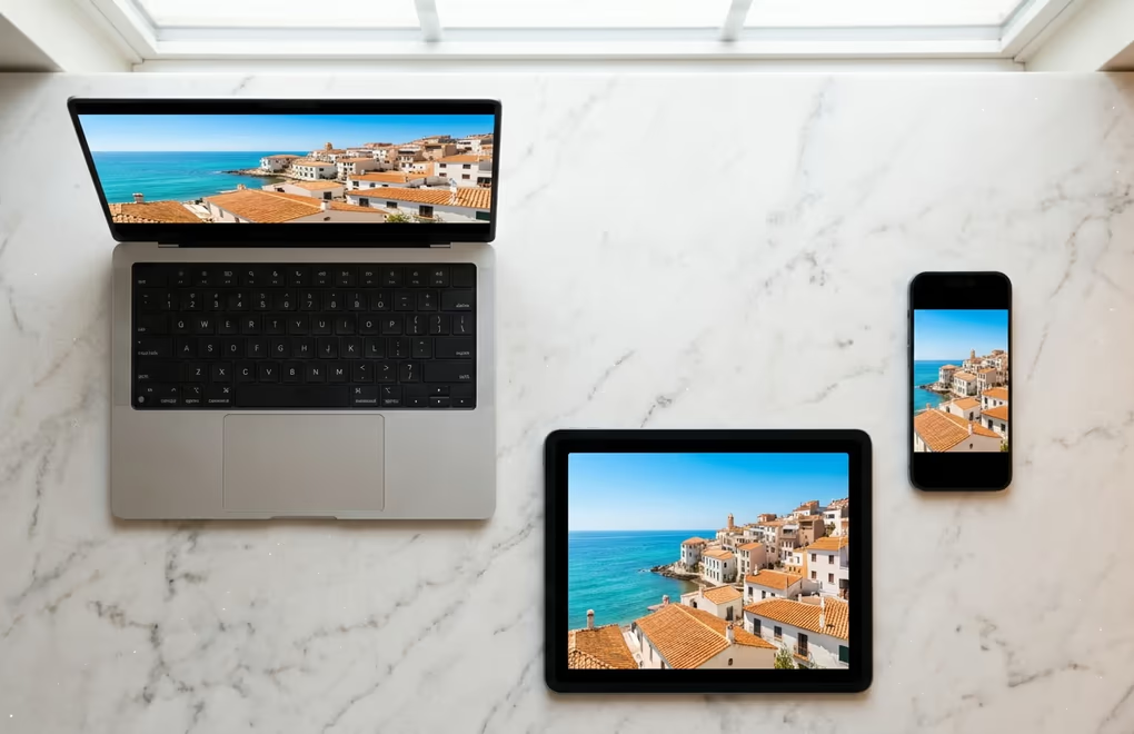
A WordPress featured image is the representative image that WordPress attaches to a post, page, or custom post type entry. It appears as the thumbnail in your blog archive, the hero banner at the top of a single post, the preview card in search results and related-post widgets, and the image that social media platforms display when someone shares your URL in a feed or a group chat.
Every WordPress theme decides how and where to display featured images, and this is where most sizing confusion originates. A theme built for blogging might show a narrow banner across the top of each post, while a portfolio theme might place featured images in a masonry grid with square tiles. Your featured image needs to look sharp in every context your theme renders it in, and because WordPress generates multiple cropped and resized copies from your single upload, the dimensions of that original file determine the quality of every version your visitors actually see on their screens.
Size affects two things that every WordPress site owner should care about: visual quality and page speed. An image that’s too small gets stretched beyond its native resolution, and the result is a blurry, pixelated hero that makes your entire site look unprofessional regardless of how good the rest of your design is. An image that’s too large adds unnecessary weight to every page load, directly hurting your Largest Contentful Paint score, which is one of Google’s Core Web Vitals and a confirmed ranking factor that affects where your pages appear in search results.
Finding the right dimensions means giving WordPress enough pixels to produce clean crops at every size your theme needs while keeping the original file from becoming a multi-megabyte burden on every visitor’s connection. The exact sweet spot depends on your theme type, and the specific numbers are in the next section.
The featured image also plays a significant role in how your content appears outside your own site. When someone shares a link to your post on Facebook, LinkedIn, X, or WhatsApp, the platform pulls your featured image through Open Graph and Twitter Card meta tags and displays it as the visual preview. If that image doesn’t match the platform’s expected aspect ratio or has too few pixels, the shared link looks broken or blurry, and potential visitors scroll right past it without a second thought.
What Size Should Your WordPress Featured Image Be?
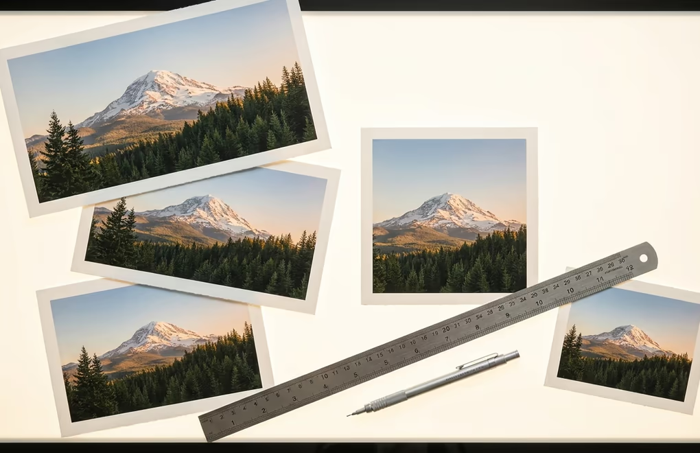
For the majority of WordPress themes, 1200 x 628 pixels at a 1.91:1 aspect ratio is the right starting point for your featured image. This dimension has become the de facto standard because it matches the Open Graph recommended image size, fits comfortably within most theme layouts without awkward cropping, and provides enough resolution for sharp rendering on standard-density screens without creating unnecessarily large files that slow down your pages.
The longer answer depends on what kind of theme you’re running and how it handles the featured image display. Classic PHP themes typically define custom featured image dimensions through the add_image_size() function in their code, and when you activate one of these themes, WordPress registers those specific crop sizes and generates the exact crops from every image you upload going forward. If you want to know exactly what dimensions your classic theme expects, search its functions.php file for add_image_size calls and you’ll find the pixel values specified right there.
Block themes handle things differently than classic themes do. Instead of PHP functions, modern block themes use a file called theme.json to define layout dimensions, and this file controls how wide and tall featured images render in templates like the single post header, the archive grid, and the query loop. Many of the best block themes for WordPress use full-width hero layouts that stretch images edge to edge across the screen, which means a 1200px-wide original gets upscaled on any monitor wider than that. For full-width block themes, uploading at 1920 x 1080 pixels (16:9 ratio) gives the browser enough pixels to display a sharp hero image even on a large desktop monitor without any visible softness.
For a standard blog theme, 1200 x 628 pixels at a 1.91:1 ratio covers your needs in most situations. Full-width block themes benefit from 1920 x 1080 pixels at 16:9 to avoid upscaling on larger screens. Magazine and grid layouts work best at around 1200 x 800 pixels (3:2 ratio), while themes that display square thumbnails need 1200 x 1200 pixels at a 1:1 ratio to prevent WordPress from cropping important parts of the image. For social media sharing through Open Graph, 1200 x 630 pixels (1.91:1) remains the universal standard across Facebook, LinkedIn, and X.
Regardless of which specific size you choose, always upload the highest quality version that WordPress can work with for your situation. WordPress generates the smaller versions automatically from your original, but it can never add quality back to a file you uploaded at too low a resolution. A reliable rule is to match or exceed the largest dimension your theme will ever display the image at, and let WordPress handle the downsizing from there through its built-in responsive image system.
How Does WordPress Handle Image Sizes Behind the Scenes?
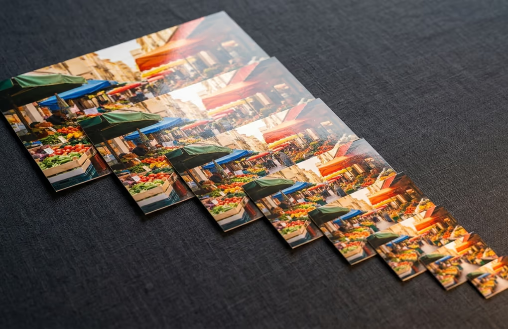
Every time you upload an image to the WordPress media library, WordPress doesn’t just store your original file and move on to the next task. It creates multiple resized copies of that image at the default sizes configured in Settings > Media and at any additional sizes registered by your active theme and installed plugins. For a single 1920 x 1080 upload, WordPress might generate six or seven different versions ranging from a 150 x 150 pixel thumbnail to a 1536-pixel-wide intermediate copy.
The default sizes that WordPress creates out of the box include thumbnail at 150 x 150 pixels (hard-cropped to a perfect square), medium at a maximum of 300 pixels on the longest side, medium_large at 768 pixels wide (which was added in WordPress 4.4), and large at a maximum of 1024 pixels wide. WordPress 5.3 introduced two additional intermediate sizes at 1536 and 2048 pixels wide to better serve high-resolution displays. Your theme and plugins can register their own custom sizes on top of these defaults, which is why some WordPress installations end up generating ten or more copies of every single image that gets uploaded to the library.
WordPress uses all these multiple versions to serve the right image to the right device through a mechanism called srcset, and understanding this mechanism is the key to getting featured image sizes right. When your theme outputs a featured image on the front end, WordPress automatically adds a srcset attribute to the img tag that lists all available sizes along with their pixel widths. The browser then looks at the visitor’s viewport width and their screen’s pixel density and picks the smallest version that will still display sharply at the current rendering size. This means a phone loading your blog archive gets the 300px-wide medium version instead of your full 1920px original, which saves bandwidth and loads faster.
The practical takeaway is that uploading a large, high-quality original gives WordPress the best raw material to work with when generating all those copies at different dimensions. If you upload a 600px-wide image, WordPress can’t generate a sharp 1024px “large” version from it because there simply aren’t enough source pixels to produce a clean result. Uploading at your theme’s maximum display width (or slightly above it) ensures every generated copy comes out looking clean and sharp.
Block themes add another layer to this system through their theme.json configuration file. A block theme can declare custom image sizes in theme.json, and WordPress registers these sizes automatically when the theme activates on a fresh installation or when you switch to it. If you move from a classic theme to a block theme, the new theme’s image sizes won’t apply to images you uploaded before the switch because those resized copies were never generated. You’ll need to regenerate thumbnails (which we cover in the customization section below) to create the new sizes for your entire existing media library.
How Do You Set and Customize Featured Image Dimensions?

Setting a featured image in WordPress is straightforward enough, but customizing the dimensions it displays at requires a few extra steps depending on which type of theme you’re running. In the block editor, you set the featured image through the post sidebar panel on the right side of the screen: open any post or page, click the Post tab, scroll down to the “Featured Image” section, and click to select or upload your chosen image from the media library.
To change the default sizes that WordPress generates from every upload, go to Settings > Media in your WordPress admin panel. You’ll find three configurable sizes there: thumbnail (default 150 x 150 pixels), medium (default maximum 300 x 300 pixels), and large (default maximum 1024 x 1024 pixels). Changing these values affects every new image upload from that point forward, but existing images already in your library keep their old generated copies at the previous dimensions until you explicitly regenerate them using a separate tool or command.
If your classic theme needs a custom image size that isn’t covered by the three defaults in the media settings, you can register one using the add_image_size() function in your theme’s functions.php file. The function accepts a name, a width, a height, and a crop parameter that controls how WordPress handles aspect ratio differences. Setting the crop parameter to true tells WordPress to hard-crop to those exact dimensions (cutting off edges if the proportions don’t match), while setting it to false maintains the original aspect ratio and scales down to fit within the maximum dimensions you specified. A line like add_image_size(‘blog-hero’, 1200, 628, true) registers a 1200 x 628 pixel hard-cropped size that WordPress will generate from every new upload automatically.
Block themes like DigiFlash work through theme.json instead of requiring manual PHP code. You can declare custom image sizes in the settings section of your theme.json file, and WordPress registers them automatically when the theme activates on the site. The advantage of this approach is that everything about your theme’s configuration lives in one structured JSON file rather than scattered across PHP functions, which makes it easier to maintain, version-control, and understand at a glance what dimensions your theme actually uses.
After changing any image size configuration, whether through Settings > Media, functions.php, or theme.json, your existing images won’t automatically receive new copies at the updated dimensions. WordPress only generates size variants at the moment of upload, not retroactively. To apply new sizes to your existing library, you’ll need to regenerate thumbnails using either a plugin like Regenerate Thumbnails or the WP-CLI command wp media regenerate from the terminal. The WP-CLI approach is significantly faster for large media libraries because it runs in the terminal without the overhead of loading the WordPress admin interface for every single image in the queue.
What Featured Image Sizes Do Social Media Platforms Need?

Your featured image doesn’t just live on your WordPress site and nowhere else. Every time someone shares a link to your post on a social platform, the receiving service pulls the image specified in your Open Graph and Twitter Card meta tags and displays it as the visual preview alongside the link. If that image doesn’t match the platform’s expected aspect ratio or resolution, it gets cropped automatically by the platform’s rendering engine, and the result is usually a preview that cuts off important parts of the image or displays it at a resolution that looks noticeably blurry.
Facebook and LinkedIn both expect images around 1200 x 630 pixels at a 1.91:1 ratio for shared link previews, and X (formerly Twitter) uses a very similar crop for its large image card format. The dimensions across these three platforms converge so closely that a single 1200 x 628 or 1200 x 630 pixel image works cleanly on all of them without any visible cropping or distortion. Pinterest is the main outlier among the popular platforms because it favors tall vertical images at a 2:3 ratio (something like 1000 x 1500 pixels), but most WordPress sites that aren’t specifically targeting Pinterest traffic don’t need to optimize for that format separately.
This convergence around 1200 x 630 is exactly why that dimension became the universal recommendation for WordPress featured images in the first place. It satisfies the social sharing platforms, provides enough width for most theme layouts, and keeps the file size reasonable for page load performance as long as you’re using a modern format with good compression.
WordPress doesn’t generate Open Graph or Twitter Card meta tags by default, which means your featured image won’t appear in social previews at all unless an SEO plugin handles that for you. Rank Math, which is the SEO plugin we use and recommend for WordPress sites, automatically generates the og:image and twitter:image tags from your featured image when you install and activate it. It also gives you the option to upload a separate social sharing image if you want to use different dimensions or a completely different visual for social previews without changing the featured image your theme displays on the actual site pages.
If your image optimization pipeline converts images to AVIF for better compression and smaller file sizes, keep in mind that some social platform crawlers don’t fully support AVIF for Open Graph images yet. Facebook handles WebP without issues, but AVIF support across social crawlers remains inconsistent in mid-2026. A practical approach is to set your OG image as WebP or JPEG for maximum compatibility and use AVIF for the in-page featured image that WordPress serves to browsers, since all modern browsers now handle AVIF rendering without any problems.
When Your Featured Image Breaks: Quick Fixes That Work
The most common featured image problem is a wrong crop that cuts off the main subject of the image entirely. WordPress crops from the center by default, which works fine for centered compositions but fails whenever the focal point sits near an edge of the original. You can fix this by editing the image directly in the WordPress media library and adjusting the crop area manually, or by installing a plugin that lets you set a custom focal point for each individual image so WordPress knows where to anchor its crops.
If your featured images stopped generating at the correct sizes after you switched themes, the fix is almost always regenerating thumbnails across your entire library. The new theme registered different image dimensions than what you had before, but WordPress only creates size variants at the initial upload time, not when themes change. Run wp media regenerate from WP-CLI, or install the Regenerate Thumbnails plugin and let it process your full library in the background while you continue working on other tasks.
Blurry featured images on retina screens happen because the display is rendering your image at twice its native pixel density. A 1200px-wide image displayed in a 1200px container looks perfectly sharp on a standard monitor, but a retina screen packs twice as many physical pixels into the same space and needs a 2400px source image for crisp results. Upload at double the display dimensions your theme uses, and rely on WordPress to handle serving the appropriately sized version to non-retina devices through srcset so they don’t download the oversized file unnecessarily. If your theme is built for performance, it should already use srcset correctly to make this automatic.



0 Comments on "WordPress Featured Image Size: The Right Dimensions for Every Theme Type"