
WordPress accessibility means making your site usable by everyone, including people who rely on screen readers, keyboard navigation, or other assistive technology. The standard that matters is WCAG 2.2 AA, and WordPress core now targets it for the admin dashboard and bundled themes. But most WordPress sites still fail basic accessibility checks because their themes strip out focus indicators, their plugins generate forms without labels, and their content skips heading levels or drops alt text from images entirely.
The gap between what WordPress core provides and what actually ships on a typical site is wide. A theme can call itself “accessibility-ready” and still miss half the requirements that screen reader users depend on. Plugins add modals and pop-ups that trap keyboard focus or ignore ARIA roles entirely. And site owners, who never test with a keyboard or a screen reader, have no idea any of this is broken.
This article covers the accessibility issues that affect WordPress sites the most, how the block editor and block themes handle them differently from classic setups, how to run a practical audit without hiring a consultant, and which plugins are worth installing versus which ones are selling you a shortcut that doesn’t work. Every recommendation here applies whether you’re running a blog, a membership site, or a digital product store built on WordPress.
What does WordPress accessibility really mean?
WordPress accessibility is the practice of building sites that work for people with visual, motor, auditory, or cognitive disabilities. The technical standard behind it is WCAG 2.2, published by the W3C, and the level that matters for most sites is AA, which covers contrast ratios, keyboard operability, text alternatives for images, and predictable navigation. WordPress core explicitly targets WCAG 2.2 AA for all new and updated code, and the WordPress Accessibility Team reviews contributions against those coding standards before they ship.
The WCAG framework rests on four principles, sometimes called POUR. Perceivable means content can be consumed through different senses, so images need alt text and videos need captions. Operable means every interactive element works with a keyboard alone, because some users can’t use a mouse. Understandable means the interface behaves predictably and uses clear language. And Robust means the HTML is clean enough for assistive technology to parse it correctly, which is where semantic markup and ARIA attributes come in.
WordPress.org offers an “accessibility-ready” tag for themes reviewed by the Theme Review Team, but the name is misleading. That tag does not mean the theme meets full WCAG 2.2 AA compliance. It means the theme passes a minimum set of checks that the review team has defined, covering contrast, skip links, keyboard controls, heading structure, form labels, and image handling. A theme can earn the tag and still have significant gaps, especially around complex components like menus, modals, or custom widgets. Treat the tag as a starting point for evaluation, not a guarantee.
Accessibility ties into broader UX and UI design principles because an accessible interface is, by definition, a more usable one for everyone, and it carries real legal weight as well. In the United States, the ADA applies to commercial websites, and lawsuits against inaccessible sites have increased every year since 2018. The European Accessibility Act, which takes full effect in June 2025, requires digital products and services sold in the EU to meet accessibility standards. If your WordPress site sells products, offers services, or collects user data in either market, accessibility is a compliance obligation alongside requirements like cookie consent.
Which accessibility issues affect WordPress sites the most?
The most common WordPress accessibility failures cluster around a handful of patterns that repeat across themes, plugins, and user content. Fixing these six areas covers the majority of what automated tools flag and what real users with disabilities actually struggle with on WordPress sites.
Keyboard navigation is the single biggest problem. Many WordPress themes remove the default focus outline on links and buttons for aesthetic reasons, using CSS like outline: none without providing a visible replacement. When a keyboard user presses Tab to move through a page, they can’t tell which element is selected. This makes the site unusable without a mouse. Dropdown menus that only open on hover compound the problem, because keyboard users can’t reach the submenu items at all. Every interactive element on a WordPress site, from navigation links to form fields to accordion toggles, must be reachable and operable with the keyboard alone.
Missing or empty alt text on images is the second most common issue. WordPress prompts for alt text when you upload an image through the media library, but it doesn’t require it. Decorative images should have an empty alt attribute (alt="") so screen readers skip them, while meaningful images need a description that conveys the same information the image does. A product photo needs its product name and key visual details in the alt text, not “IMG_4829” or “photo” or nothing at all.
Heading hierarchy violations show up on almost every WordPress site that uses a page builder or freestyle content editing. The correct structure starts with a single H1 (typically the page or post title), followed by H2s for major sections, H3s for subsections within those, and so on without skipping levels. When a content creator jumps from H1 to H4 because they prefer the smaller font size, or uses H2 and H3 interchangeably for visual styling, screen reader users lose the structural map of the page. They rely on heading levels to navigate long content the way sighted users rely on visual hierarchy.
Color contrast failures affect readability for users with low vision, and they’re surprisingly common in WordPress themes that prioritize aesthetics over function. WCAG 2.2 AA requires a contrast ratio of at least 4.5:1 for normal text and 3:1 for large text (18px bold or 24px regular). Light gray text on a white background, pastel buttons with white labels, and placeholder text in form fields routinely fail these ratios. You can check any color pair instantly with the WebAIM Contrast Checker.
Forms without proper labels are a persistent issue because many contact form plugins rely on placeholder text as the only indicator of what a field expects. Placeholder text disappears when the user starts typing, and screen readers may not announce it at all depending on the browser. Every form field needs a visible <label> element associated with its input through the for attribute, which both tells the user what to type and gives screen readers something to announce.
Skip links are missing from many WordPress themes entirely. A skip link is a hidden link at the very top of the page that becomes visible on keyboard focus and lets the user jump directly to the main content, bypassing the full site navigation. Without it, a keyboard user has to Tab through every menu item on every single page load before reaching the content they came for. WordPress core themes like Twenty Twenty-Five include skip links by default, but many third-party themes omit them.
How do block themes and Gutenberg handle accessibility?
The block editor introduced in WordPress 5.0 generates cleaner semantic HTML than most classic themes and page builders, which gives it a natural advantage for accessibility. Each core block outputs predictable markup: a Heading block produces a proper <h2> through <h6>, a Paragraph block produces a <p>, and a List block produces a real <ul> or <ol>. Classic page builders often wrapped everything in nested <div> layers with classes like row, column, and inner-wrapper, which stripped the content of its semantic meaning and made it harder for assistive technology to interpret. If you’re weighing the two approaches, the Gutenberg vs page builders comparison covers the structural differences in detail.
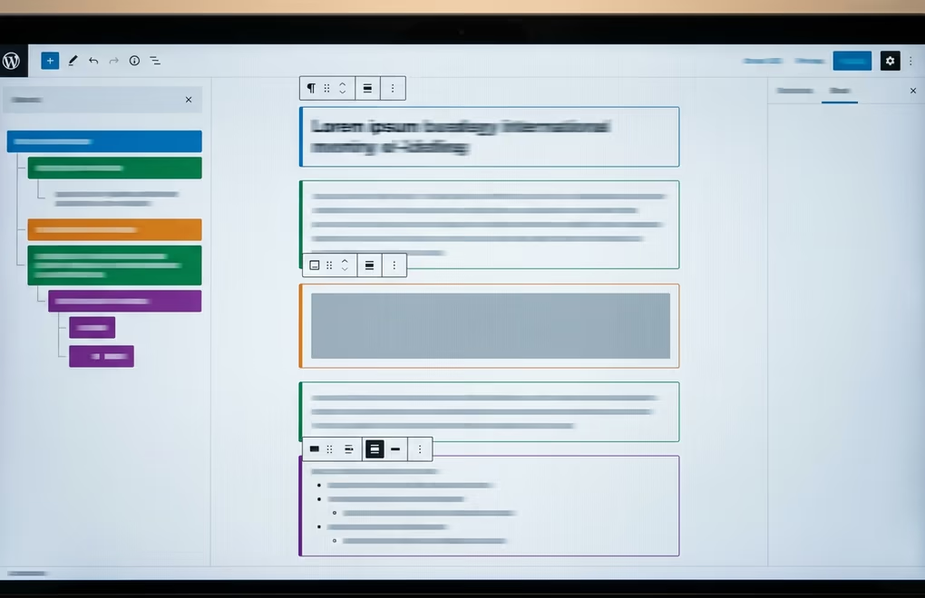
Block themes, which use the Site Editor and theme.json for global styles, build on this foundation. They output HTML5 landmark elements like <header>, <main>, <footer>, and <nav> as part of their template structure, so screen readers can identify page regions without relying on ARIA roles. The block editor also warns content creators when they skip heading levels, showing a notice in the block sidebar that says the heading level creates a gap in the hierarchy. This is a small feature that prevents a common accessibility failure at the point of content creation.
Image blocks in Gutenberg prompt for alt text in the block settings panel, and the media library preserves alt text across insertions if you set it during upload. The block editor also handles figure and figcaption markup correctly, wrapping images in <figure> elements when a caption is present. This matters because screen readers use figcaption as supplementary context for the image.
Where block themes fall short is in complex interactive patterns. The Navigation block handles basic menus well, but responsive mobile menus, mega menus with multiple columns, and flyout submenus still need careful ARIA implementation that not every block theme gets right. Custom blocks from third-party plugins can also break accessibility if the developer didn’t test with keyboard and screen reader users. A tabs block that doesn’t implement role="tablist", role="tab", and role="tabpanel" with proper arrow-key navigation will confuse assistive technology even if it looks fine visually.
If you’re building with a block-based setup, the practical advice is to stick with core blocks and well-maintained block libraries like DigiBlocks that follow WordPress accessibility coding standards. Test every custom block you add by tabbing through it with your keyboard and checking that focus moves logically, that interactive states are announced by screen readers, and that ARIA attributes match the component pattern from the WAI-ARIA Authoring Practices guide.
How can you audit your WordPress site for accessibility?
You don’t need to hire an accessibility consultant to find the most impactful issues on your WordPress site. A combination of three free tools and one manual test covers the majority of WCAG 2.2 AA violations, and the whole process takes about fifteen minutes per page.
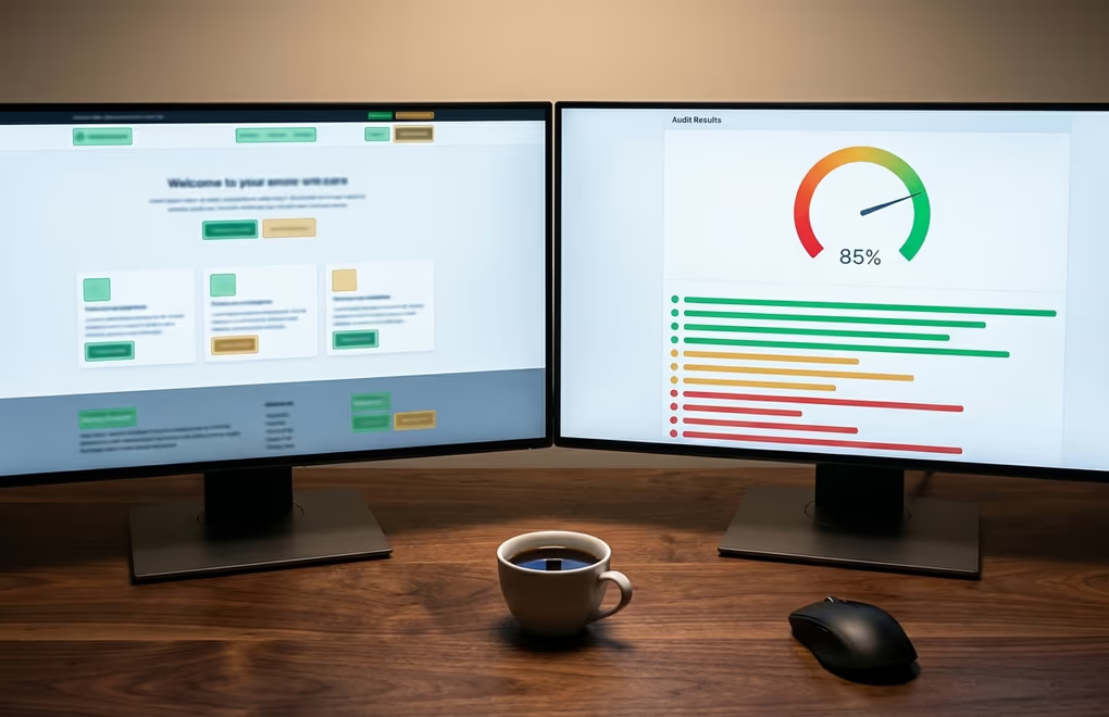
Start with Lighthouse in Chrome DevTools. Open any page on your site, press F12, go to the Lighthouse tab, and run an accessibility audit. Lighthouse checks for missing alt text, low contrast ratios, missing form labels, incorrect ARIA attributes, and heading order violations. It gives you a score out of 100 and lists each issue with a direct link to the affected element in the DOM. A score below 90 means there are real problems to fix, and the items Lighthouse flags are almost always valid findings.
Then install the axe DevTools browser extension from Deque, which runs a deeper automated check than Lighthouse. Open axe from the DevTools panel after loading your page, click “Scan All of My Page”, and review the results grouped by severity. axe catches issues Lighthouse misses, including keyboard traps, empty buttons, and ARIA roles that don’t match their expected pattern. The free version covers the vast majority of automated checks; the paid version adds guided manual testing flows, but you can do those yourself.
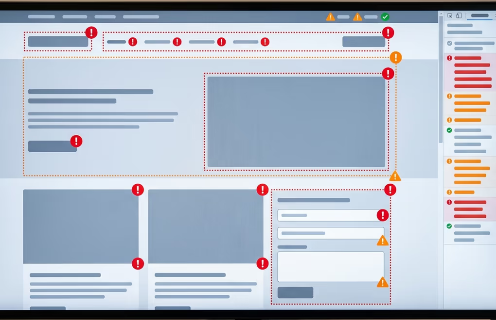
WAVE, the Web Accessibility Evaluation Tool from WebAIM, offers a visual overlay that marks accessibility issues directly on your page. It highlights missing alt text with red icons, flags contrast errors, and shows your heading structure in a sidebar panel. WAVE is particularly good for visual learners who want to see where the problems are rather than reading a list in DevTools.
The manual test that matters most is the keyboard-only walkthrough. Close your mouse, open your homepage, and press Tab repeatedly through the entire page. Watch for these five things: can you see which element has focus at all times (a visible outline or highlight)? Can you reach every link, button, and form field? Can you open and close menus and dropdowns? Does focus move in a logical order that matches the visual layout? And can you skip to the main content without tabbing through the entire navigation? If the answer to any of these is no, you have a real accessibility barrier that no plugin or overlay can paper over.
For a quick screen reader test, macOS users can press Command+F5 to activate VoiceOver and then navigate the page using the VoiceOver rotor (VO+U) to browse headings, links, and landmarks. Windows users can download NVDA for free and do the same. You don’t need to become an expert screen reader user, but spending five minutes listening to how your site sounds will reveal issues that no automated tool catches, like links that say “click here” or “read more” without any context about where they lead.
Which plugins actually help with WordPress accessibility?
A few WordPress plugins genuinely fix common accessibility issues, but they work best as a supplement to a properly built theme, not as a replacement for one. If your theme has fundamental structural problems, like missing landmark elements, no skip link, or JavaScript-dependent navigation without keyboard support, no plugin will fix that cleanly.
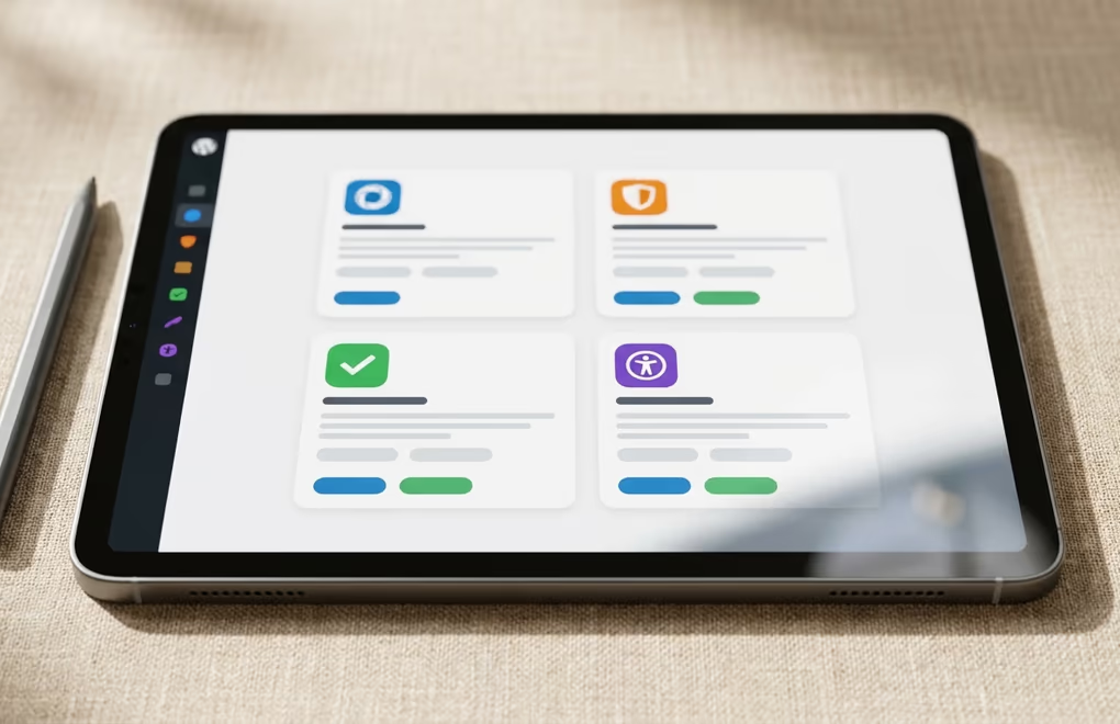
WP Accessibility by Joe Dolson is the most established free option, and it addresses several of the issues covered in this article directly. It can add a skip link to themes that lack one, force a visible focus outline on interactive elements, remove the target="_blank" attribute from links (which can disorient screen reader users), add language attributes to the HTML element, and strip title attributes that duplicate link text. It also provides a toolbar that lets visitors toggle high contrast mode and increase font size. Joe Dolson is a member of the WordPress Accessibility Team, so the plugin follows the same coding standards as WordPress core.
Sa11y (pronounced “Sally”) is a different kind of tool. Instead of fixing issues for visitors, it runs an accessibility check for content editors directly inside the WordPress admin. When you preview or edit a page, Sa11y highlights problems like missing alt text, skipped headings, empty links, and contrast failures with annotations right on the content. It’s particularly useful for teams where multiple people create content, because it catches common mistakes before they go live, without requiring everyone to learn Lighthouse or axe.
One Stop Accessibility is a lighter-weight option that adds an accessibility toolbar to the front end with controls for contrast, font size, link highlighting, and cursor size. It works well for sites that need a quick accessibility improvement layer while the underlying theme is being fixed, and it’s free for basic use.
Accessibility overlays, on the other hand, are a category of tools you should approach with serious skepticism. Companies like AccessiBe, UserWay, and AudioEye sell JavaScript widgets that promise to make any site accessible automatically. The technical reality is that an overlay can’t fix structural HTML problems, can’t add missing semantic meaning to a <div>-heavy layout, and can’t reliably map ARIA roles onto components it doesn’t understand. The National Federation of the Blind, one of the largest disability rights organizations in the US, has publicly opposed overlays, and accessibility professionals widely consider them a liability rather than a solution. If a vendor tells you their one-line JavaScript snippet will make your site WCAG compliant, ask them how their script fixes a missing skip link or a heading hierarchy violation in server-rendered HTML. The honest answer is that it can’t.
The most reliable path to WordPress accessibility is choosing a well-built block theme that starts with clean semantic markup, testing it with the audit tools described above, and using a plugin like WP Accessibility or Sa11y to fill specific gaps. That combination costs nothing and produces better results than any overlay subscription.
Making every visitor welcome on your WordPress site
WordPress accessibility isn’t a feature you bolt on after the site is built. It’s a set of decisions that start with your theme choice, carry through your content creation process, and get validated with the same kind of testing you’d give any other quality requirement. The block editor and block themes have made the technical foundation better than it was five years ago, and free audit tools like Lighthouse, axe, and WAVE make it possible to find the worst issues in minutes rather than days.
If you’re looking at your WordPress site right now and wondering where to begin, start with the keyboard test. Tab through your homepage and your most important landing page. Every problem you find there, from invisible focus indicators to trapped menus to unlabeled form fields, is a problem a real visitor has already encountered and either worked around or given up on. Fix those first, and you’ll have a site that works better for everyone, including the users who were never going to tell you it was broken.




0 Comments on "WordPress Accessibility: What to Fix First on Your Site"